Windows 8: A Usability Nightmare

This is what happens when you try to design a solution for two different problems. A touch OS is not a the same as a desktop OS. That is, an interface that requires touch needs to be designed differently than an interface that uses a pointer. Windows 8 is lazy, it lacks any visual cues, it is inconsistent, there is no logic anywhere, it is a horse designed by committee.

I haven’t used Windows 8 without a mouse, like most people, because there is no benefit to running it on a tablet. If you are running it on the Windows tablet, you have almost no storage left after the usual bloated install, you have a confused OS, and you must buy accessories to make it work like a laptop, and its more expensive.

Windows-8-Screenshots-Windows-Charms-bar

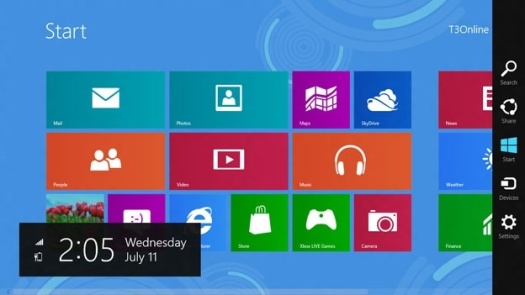
Windows 8 has a massive clock overlaid at random on top of more important things. Also Devices aren’t in Settings, for no reason whatsoever.

The Surface OS is utterly baffling, some examples;

  • What do the tiles represent?
  • What screen are the tiles on?
  • Why are the tiles in meaningless groups?
  • Why is the menu bar on the right, it interferes with the tiles and how do we know its there?
  • Is it a desktop or touch OS?
  • How do you know what app you are in?
  • Why are devices not in settings?
  • How do you open a new tab in the web browser?
  • Why is the URL bar at the bottom of the web browser?
  • How do you install a new browser and where does it reside on the hard disk?
  • How do you navigate or orient yourself within the OS?
  • Why is the clock so damn big and floating over everything else randomly?

It seems that usability and user experience is still grossly misunderstood by most  enterprises that pretend to champion them. Probably because democracy has no place in design; there must be a purpose for the design to serve. Microsoft have again misunderstood this and gone to far in the form over function.

“Most people make the mistake of thinking design is what it looks like. People think it’s this veneer – that the designers are handed this box and told, ‘Make it look good!’ That’s not what we think design is. It’s not just what it looks like and feels like. Design is how it works.” – Steve Jobs

This is a perfect example of why Apple are so far ahead; they know what they are doing, they identify the market and engineer something thoughtful for them, something logical that a two year old can use (true story, my two year old nephew uses an iPad with ease). The iPad is so usable because it is thought out properly, it is clear logical and ordered, it makes sense.

Microsoft are so late that they cobble some pointless junk together, like they did with the Zune, and get it to market far too late, and more importantly, far too flawed.

Who the hell does a Surface benefit and why?
What is a User Interface?

You work with a user interface (or UI) everyday, yes you. You can’t watch TV without using it’s UI, you can’t wash your clothes without using the washer’s UI, same with the microwave or your car dashboard, the Internet, or your mobile phone — all of these things have an interface that you interact with. Essentially this is what a user interface is;

The layer between you and the thing you are trying to use.

In a world where we are increasingly dependent on technology, what becomes important is how well that UI works — this is exactly what helps us to define usability.

For example, you may have the best car in the world, the most expensive desirable beautiful car ever made. However, if the designers put the ignition under the breaks for some stupid reason (to save money, because its trendy, etc) then you won’t be able to use the car; it will be useless. And 9/10 times this is exactly what happens because not enough people put us users first.

We are all users first.

If something is not usable it is useless, if it is useless then no-one will use it. This is the difference between choosing a car, a phone, a computer, a new app. It could not be more important yet it so often overlooked!

3 Reasons Why You Should Underline Hyperlinks

Hyperlinks, or links, are the defining feature of the Internet. As Wikipedia states:

Tim Berners-Lee saw the possibility of using hyperlinks to link any information to any other information over the Internet. Hyperlinks were therefore integral to the creation of the World Wide Web. Web pages are written in the hypertext mark-up system HTML.”

Imagine trying to use the Internet without hyperlinks! Although it seems obvious, many websites don’t underline links at all — instead favoring form over function. Here are some reasons why you should leave your hyperlinks underlined:

  1. Usability — underlined links are easier to notice when scanning a webpage, it further distinguishes the link text from normal text. This allows visitors to accomplish their goals more quickly;
  2. Accessibility — your website is more accessible when hyperlinks are underlined. You should never rely on colour alone to convey functionality, think about visually impaired users;
  3. Familiarity — visitors expect links to be underlined (hyperlinks are underlined by default), and people love having their expectations met, therefore doing so will make your website more satisfying to use.

Further reading:

Email & Bacon

Although this meme (pictured right) is obviously a joke, it does highlight just how subjective icons can be.

The icons are supposed to represent ‘Off’ at the top, and ‘On’ at the bottom. However, the iconography used makes this information slightly ambiguous.

Our attention is crucial when driving — most accidents occur when the driver is not focused on the road. Which begs the question (in this context at least):

Why use images when words will do?

via Unpressable Buttons